
I previously shared maps based on data from The New York Times showing how COVID-19 cases and deaths had spread across the US. It has infected nearly every corner of the US, although public perception probably links it more with urban centers like New York City.
It’s tempting to see the COVID-19 spread in terms of the case count and the policies of various governors and other leaders to enact restrictions, “shelter-in-place” orders and similar guidance. IMO, that would be a misreading. Thanks to Google, we have an insight into what the American public actually did and when they did it regarding social distancing and stay-in-place compliance as COVID-19 spread.
From this data, I believe that America (mostly) didn’t shut down because leaders told us to. America shut down because the American people, writ large, decided it was the only safe thing to do. Then our leaders ratified what was already a public consensus. There are some exceptions. Governors Newsom and Inslee in California and Washington took aggressive early stands that arguably drove action before their state population had fully internalized the threat. People in the rest of the country all started to change their personal behavior at about the same time.
Today, the country is debating whether to re-open the economy, when to begin the reopening and how to manage the process if we do it. Once again, officials are enacting policies. But I believe it will again be up to the American people to decide where, when and how strongly to comply.
Google Community Mobility Report (CMR)
Google tracks the location of people as they use Google Maps to travel between various places. As people interact with the maps, Google can estimate what the population has done. Google is sharing high level summaries of this data with anyone who wants to download here. I explore it using the R Statistics ecosystem and my first, tentative results are given here … in two parts:
- The first section maps the results over time and notes some interesting features and phenomena. It’s the heart of this post.
- I add an Appendix about my experience with the Google data, Read it if you need a geek fix.
COVID Impact on American Mobility
A “shelter-in-place” or lockdown policy is a last-resort method to halt the spread of a virus when no other technique will work. It is by all accounts, necessary with COVID-19 because the virus can be transmitted by people who are asymptomatic. If you could easily identify the carriers, other techniques might work. Since we can’t tell who is infectious and who is not, the only approach is to make everyone stay away from everyone else.
That means that we should see the impact of “shelter-in-place” policies in the movement patterns of the American public. CMR reports on six types of journeys that might be revealing. I’ve focused on four of them: journeys to work, journeys to retail and entertainment, journeys to get essentials (e.g., groceries), and journeys to personal residences. I spent less time considering the two other categories: journeys to parks and journeys to transit stops. They may apply in some settings, but they aren’t as universal as the first four.
Travel to Work and Job
The following graphs show the changes in Google’s travel to work measurements for 9 selected states as far as the latest reported date, May 2, 2020. The blue lines are the “smoothed” estimates of the data. They’re intended to convey the general pattern of change without getting lost in the weeds of individual data points. The colored rectangles designate the time period when each state enacted an official state-wide “shelter-in-place” order or equivalent. Some cities and counties had local orders up to a week earlier, but the colored regions are the official state-wide restrictions.
I see three interesting aspects to these graphs:
- Substantive compliance began at the same time nationwide – Changes in work commutes occurred at almost the exact same time everywhere. For example, workers in Mississippi and Georgia stopped commuting at the same time as workers in Michigan and Washington.
- The public started locking down before they were ordered to. – Nationwide, it seems that non-essential companies sent their workers home and/or furloughed them well before State rules required it. Alternatively, individuals stayed home even though they were not legally obligated to do so.
- States that were aggressive suppressed work travel by 60+% – California and New York were especially effective. States like Mississippi paid temporary lip service to the shutdown (a shorter 35% reduction), but were largely back to previous activity levels by early May. Of course, Mississippi is a comparatively rural state, so it’s not clear how much “commuting” actually occurs in normal times.
This paints a different picture than the one cited by authorities and the media. To me, it looks like Americans decided on their own to close businesses and stop going to work. If this is even partly true, the current debate about “re-opening” may miss the mark. What Georgia’s Gov. Kemp says may not matter if people in Georgia see re-emergence as unsafe.
In the following video the changes in travel behavior are shown for each county in the US. Counties in green mean that people made fewer trips to work in that county on that date than on typical days in the past.
The video suggests that compliance levels were quite localized. Urban areas went green and stayed green. Less urbanized areas were more variable. Some were diligent about staying home, while others exhibited a superficial and temporary response. Some maintained a steady level of movement, while others shifted frequently. America has not acted as one in this matter.
The patterns are further confused by the likelihood of structural changes to the work landscape. By early May, 15 to 20% of Americans had lost their job. Their “stay-at-home” is now involuntary and hard to reverse. Also, there is anecdotal evidence that big urban commuting patterns may not recover the same way. White collar companies are finding that working from home is indeed productive. They may not want to pay rent on big office spaces if they don’t need to. In sum, a portion of the previous commuting volume may be permanently suppressed … independent of government actions on COVID-19.
Outside the urban areas, the recovery pattern may be similar or different, but I find that much harder to read.
Travel to Retail and Recreation
This is the Google category that most resembles casual, discretionary travel. If everyone really “stays-at-home”, they won’t go out to stores, restaurants and entertainment. As with work destinations, the big drop in activity began before most states instituted mandatory shutdowns. Even in California, trips started down a week or two before the statewide order demanded it. To be fair, big population centers like the Bay Area and L.A. started lockdowns about a week earlier, so that might explain it. However, the shape of the curve is so similar to those in other states that it is hard to fully credit it to local actions. It looks more like a lot of people decided on their own to avoid risky places and stay home.
This version of the graph is overlaid on the growth in COVID-19 cases that was happening at the time. The striking feature is the fact that cases and (shortly) deaths, were exploding in New York state and especially in New York City. That was widely reported in the news, shortly after the news reported the tragic death rates in Italy and Spain. It doesn’t seem a reach to believe that many Americans were spooked by the combination of events and started to self-isolate before they were officially ordered to do so.
In a similar way, activity began to increase even before lockdowns started to end and states decided to “re-open”. Unfortunately, it is difficult to link this to specific causes. For example, one can speculate that some activity is created by new behaviors that resemble old behaviors when seen in the Google data. For example, people who used to dine-in at restaurants may have switched to making pickups at the same locations. Trips may have resumed even while maintaining social distancing. There is no way to tell in the Google data. As “phased re-openings” permit outdoor seating and sparse indoor dining, that may factor in also.
Viewing the national activity, I get the impression that, initially, the public took rapid, decisive action to cut their activities. This happened all across the country. It is only speculation, but it resembles what one would expect if everyone were equally scared by national and local news reports.
Travel for Groceries and to Pharmacies
This measure is a bit odd. In theory, people shouldn’t be traveling any more or less for staples and essentials under lockdown as they would have in normal times. The data, however, suggests a different behavior that aligns reassuringly with many press reports from the time.
Note the data points in the yellow areas. The general smoothed pattern matches the other measures (work and retail) pretty closely. Except there was a one week period where trips for essentials jumped well above the prevailing pattern. This fits with press reports of panic buying and hoarding toilet-paper. Moreover, the spikes in activity occurred nation-wide, which is also consistent with a broad based public fear.
In some ways this data doesn’t tell us anything we didn’t know. However, the fact that we can see behavior consistent with panic buying, at the exact time the national and local press reported it, gives me more confidence in the relevance of the Google data.
Journeys to/from Residences
Google is not very clear about what “journey to residence” really means. Does it mean trips to a person’s principle residence (if so, where from) or does it include trips to anyone’s home? In either case, unlike the other measures, these trips increased dramatically as other trips declined.
The color scale on this video is different from the previous ones. Green means people are traveling more to residences (their own and possibly others?), not less. Orange or red suggests that these are less popular destinations than they used to be.
Presumably, that indicates that people aren’t out and about in public, although it could mean that people are traveling to the hopes of friends and family more often. After mid-March, there is a lot more green, but that largely goes away by the end of April.
Either way, Americans appear to have been homebodies in late March, but then loosened up by the end of April. As with the other maps, there are some interesting exceptions.
Highlights and Insights
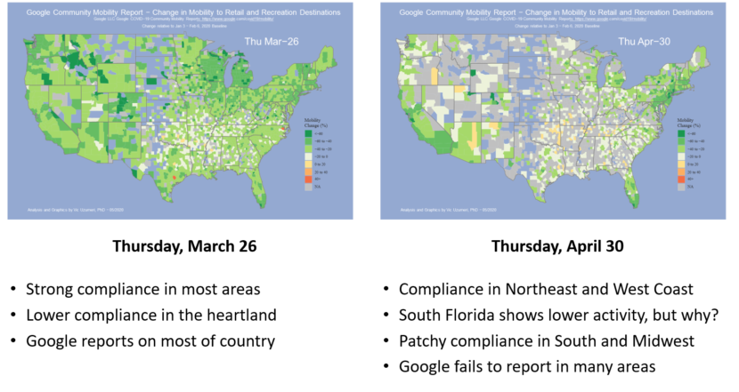
In all of the movies, the behavioral shifts are striking. When Americans shut down, they did so diligently. After the first couple of weeks, compliance became increasingly haphazard and patchy. With its ongoing, frightening casualty count, the Northeast remained aggressively suppressed. The West Coast was also been steady and consistent. The rest of the country is a mixed bag.
One anomaly is South Florida. In most of the data and videos, it is consistently well suppressed (i.e., green). That seems odd given the relatively relaxed approach of the Florida Governor. It’s tempting to wonder if Google’s measurement methodology is playing tricks. For example, could the travel levels be consistently low because a lot of the snowbirds suddenly went home? Google doesn’t give enough background info to draw any conclusion.
The wide variation in reactions and activity may be partly explained by the differences in day-to-day life across the country, and especially between urban and rural areas.
It is grist for another blog article, but the Google data suggests that there are big differences between attitudes and behaviors in various parts of the country. Unfortunately, the COVID-19 virus is agnostic to regional differences. It will spread wherever it can, be it the NYSE trading floor, a rural fish processing plant or a heartland church service.
The core premise of “shelter-in-place” was to suppress and stop the virus from spreading … to anyone. Where it was applied aggressively, it seems to be working. However, there are many areas of the country where it was started in earnest, but quickly abandoned. Now localities are exploring ways to rescind it. In none of those areas has the COVID virus been eradicated.
All of this has been driven or influenced by the attitudes and actions of the American people. Now we will see how the American people handle the process of re-opening the economy.
FWIW, I am not optimistic.
Appendix – CMR Details
Google Community Mobility Report (CMR)
Google shares extracts from the data that Google Maps uses to report on how users patronize various establishments. According to Google, it’s the data that drives their secret algorithm to produce charts like this.
Measuring Changing Movement Patterns
The following chart is from the Community Mobility Report (CMR) for Fulton County, GA. The CMR begins with a “baseline” that is the median level of travel activity in each of the 6 categories for each day of the week between Jan 3, 2020 and Feb 6, 2020. The baseline for Tuesday may be different from the baseline for Sunday. In the chart, the baseline is the straight line at the top of the light blue area.
Starting Feb 15, 2020, Google plotted the observed level of travel activity each day to the baseline for the corresponding day of the week. That is the heavy blue line under the light blue area. The light blue area is a visual indicator of the amount of change that has occurred in people’s real-life travel activity, in this case for one county in Georgia (actually Atlanta). The CMR has data for every state and county in the US and most countries of the World.
Validation
Google’s algorithm hides most of the details underlying the numbers. For example, there is no information about absolute travel volumes across different counties or states. Even if two counties are adjacent, one might have a much bigger base of travel activity than the other. All we are told is the magnitude and direction of the change that occurred within each geographic area. That is important information, but it is far from a complete picture.
There is some reassurance about the quality of the data from the results. For example, the fact that the panic buying spree shows so clearly across the country suggests that the data and calculations are realistic. Similarly, the fact that travel suppression is much stronger in California or New York than in Mississippi also speaks well for the data. But that is all of the validation that we have.
Google Policies and Privacy
Google is very careful about how it publishes the CMR data. In Google’s own words:
“These datasets show how visits and length of stay at different places change compared to a baseline. We calculate these changes using the same kind of aggregated and anonymized data used to show popular times for places in Google Maps. Changes for each day are compared to a baseline value for that day of the week:
The baseline is the median value, for the corresponding day of the week, during the 5-week period Jan 3–Feb 6, 2020.
The datasets show trends over several months with the most recent data representing approximately 2-3 days ago—this is how long it takes to produce the datasets.
What data is included in the calculation depends on user settings, connectivity, and whether it meets our privacy threshold. If the privacy threshold isn’t met (when somewhere isn’t busy enough to ensure anonymity) we don’t show a change for the day. As a result, you may encounter empty fields for certain places and dates.
We include categories that are useful to social distancing efforts as well as access to essential services.
We calculate these insights based on data from users who have opted-in to Location History for their Google Account, so the data represents a sample of our users. As with all samples, this may or may not represent the exact behavior of a wider population.”
Google’s concerns for protecting its proprietary information and user privacy require that the data be frequently incomplete if showing a value might lead to direct insights about travelers or their destinations. I’ve used three different cues on the map:
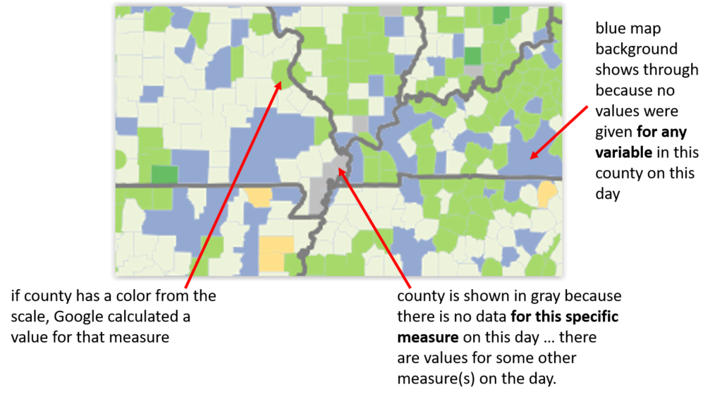
If Google reports a change in travel intensity for a given measure (e.g., trips to work) on a given day, the county will have a color that matches the scale. If Google reports values for some measures, but not all, for a given county on a given day, the ones that it doesn’t report are shown in gray as “NA”. If Google didn’t report values for any variable in the county on a given day, the county is left blank and the blue map background shows through.