
Since I have more time on my hands than I really wanted or planned, I’ve been working through various analysis and visualization options in the R statistics ecosystem. The latest exploration exploits the fine data collection that the NY Times makes publicly available at its GitHub site.
When you read the news or listen to commentary on TV, it’s easy to presume that most of the COVID-19 cases are in big cities. In terms of absolute numbers, that’s true. However, if you scale the case count for differences in population, a different picture emerges. Watch this movie to see how COVID has spread across and throughout America.
This movie shows how confirmed cases of COVID have developed across the country. In this context, it’s important to remember that new case volumes are driven by two factors:
- The local rate of infection
- The aggressiveness of local testing
There are anecdotal accounts that various jurisdictions are/were more or less agressive in their testing. Early on, that was dictated by the availability of testing. As tests become more readily available, it depends more on the testing protocol and policy. If a city offers free, drive-up testing to the public (no prescription required), it will likely report more confirmed cases than a locale that uses a more conservative approach.
Nonetheless, the video shows patterns of new cases that are so widespread that I can’t believe the story is simply about testing protocol. IMO, this video shows the broad brush pattern by which COVID-19 spread across America.
Correspondingly, the following movie traces the relative death rate from COVID-19 across the country from March 10 to May 1. Fortunately, death rates are lot lower than case rates, so the map is less busy. Even so, at the time of writing, 65,000 people have passed. Given the widespread coverage of the virus, it seems clear that many more will follow.
Perhaps more than any regional pattern, this video sends the message that deaths are nation-wide. In big cities, small towns and rural counties. It’s not a trend that can be reversed with a single policy or a silver bullet. The force that make COVID-19 lethal is widespread and mobile.
If you would like to review the maps in a more controlled and scalable format, you can download the source PDFs for usacases and usadeaths.
New York City
My first comment relates to a special situation. The data sources behind the maps in the movies treat the New York City area inconsistently. New York reports COVID statistics for the 5 boroughs, but the rest of the NY Times data is keyed to US counties. I fiddled for a while to try to get them aligned, but I gave up. That’s why the maps have a little white space where NYC should be. To compensate, the following graphs for NYC show data scaled the same way as the maps.
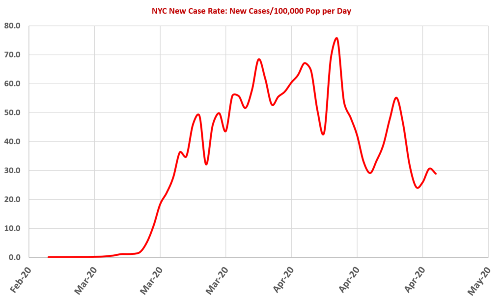
The main observation is that, while NYC has a high absolute rate of new cases, it is less alarming if it is scaled to the area’s population. The rates of 50 to 70 new cases per day per 100,000 persons is less than rates seen in many other locations around the country. If anything, the rates suggest that the State’s aggressive shelter-in-place restrictions did their job. Despite the high population density, they held the rate to a level that severely stressed, but did not overwhelm, the local healthcare system. They indeed “flattened the curve”.

When scaled to population, the death rate is similarly controlled. It peaked around 6 or 7 per day per 100,000 in late April and has mostly fallen since then. With a NYC population over 8 million, that’s a tragic amount of death. Even so, it is a positive testament to the way state and local governments have managed the problem.
Regional Patterns and Differences.
Please use the video players to review the sequence of maps forward and back. Pause the video and look at the patterns that you see. There are many things to note, but I’ve observed several interesting patterns and contrasts that are described below.
California
By all expectations, California should be the COVID hotbed of the US. It has the largest population of any state. It’s on the west coast and it’s where most flights arrive from Asia. It has large, diverse and dense cities where an infection could grab hold and not let go.
Yet the following images show that California has been relatively lightly impacted by COVID-19. There are lots of cases, but they are pretty broadly and thinly spread.
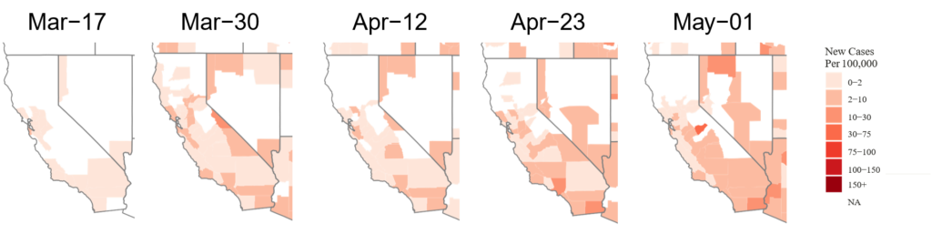
California took the earliest and most aggressive approach to try to suppress the virus. If you view the videos, it is evident that California didn’t allow any significant hotspots to gain a foothold. It has lots of fertile territory (San Diego, LA and the Bay Area) for concentrations to emerge … but new cases have stayed on a slow simmer. Since California is one of the most aggressive areas for testing, that is even more noteworthy. Kudos to Gov. Newsome and all of the local state and municipal officials. If I understand this article correctly, special props are due to Dr. Sarah Cody in the Bay Area.
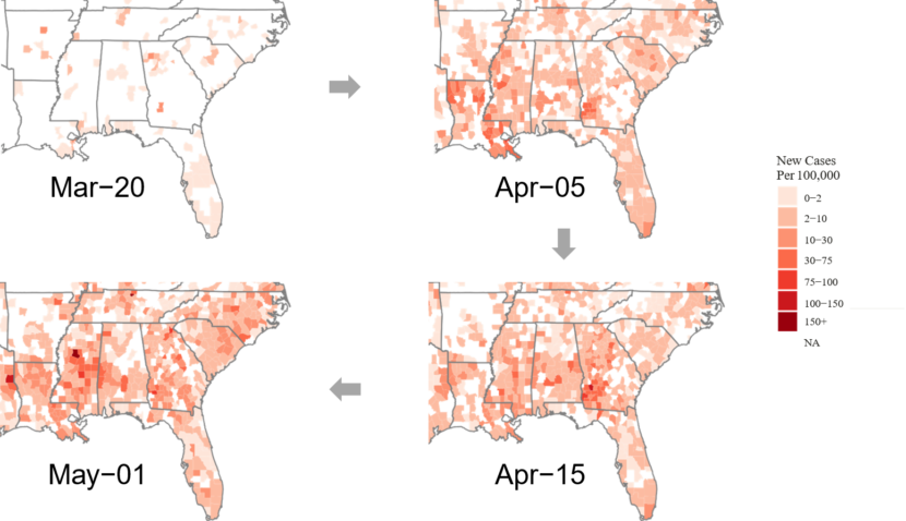
Southeastern States
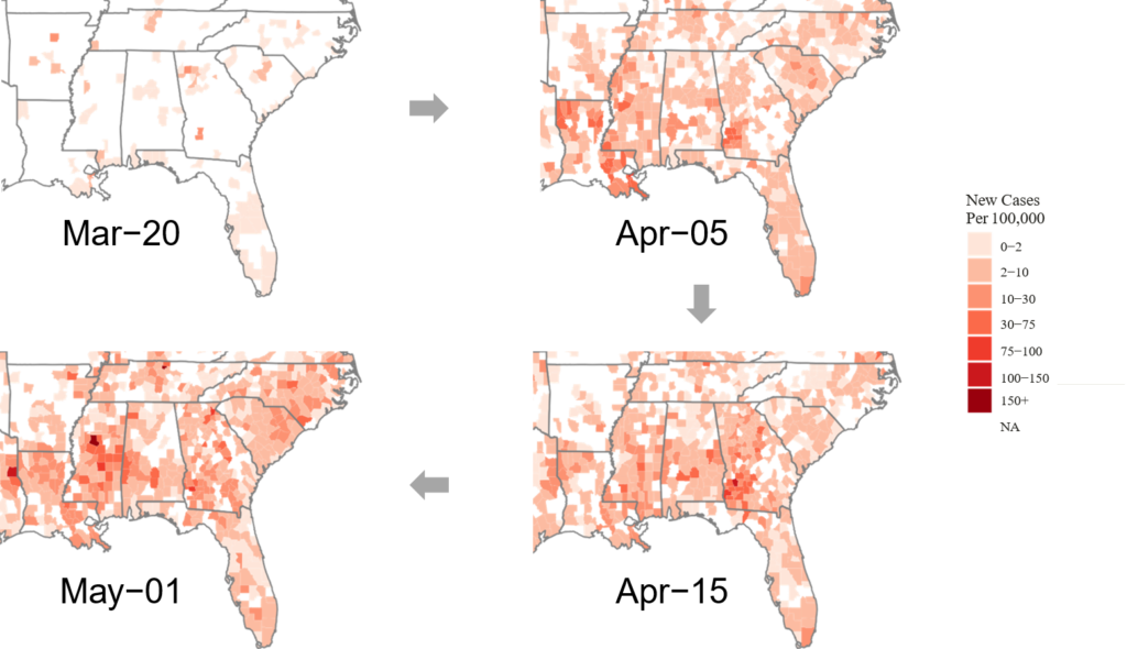
The Southeastern US is a hot mess, but less so in the major cities. Try to locate Atlanta or Birmingham based on the visible case pattern. They don’t stand out, presumably because the City and metro areas enacted tough suppression measures fairly early. Now their Governors are hell-bent to relax all of those restrictions, at least partly at the behest of the smaller counties and towns where people still think it won’t happen to them.
In downstate and rural Georgia, the total number of cases isn’t that scary … unless you compare them to the size of the local population. Then it’s clear that Georgia is a petri dish for COVID almost everywhere outside of the Atlanta urban area. What is worrisome is the likelihood that people from the surrounding counties will drive into Atlanta to work, shop, visit family, etc. … and bring COVID with them. Then we will see how it spreads in a dense urban area where people don’t think they need to social distance anymore.
(Editorial Note: I live in Atlanta)
Alabama and Mississippi are in even worse shape. There is significant COVID presence all over each state. They are clearly not protected by their rural environment. The houses may be farther apart, but I am guessing that people still want to socialize. Ironically, that may mean less frequent, but more intense, get-togethers … like a church congregation or a town meeting.
Midwest
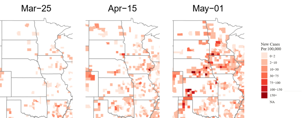
The Midwest is another hot mess. Initially, infection rates were low to non-existent. Nebraska in late March probably thought it would escape serious impacts. By the first of May, not so much. The pattern is interesting because it doesn’t show a broad incidence of infection. It shows intense clusters of infections in relatively small areas. I suspect this will continue to be the pattern for rural areas. COVID won’t show up in the corn fields and pastures. It will spread like wildfire in the long-term residency homes and large packing plants. Then it will spill over to the families and communities of the workers.
Death Rates
Death rates are a pretty definitive measure, but their meaning is actually harder to pin down. A lot of factors affect whether someone dies of COVID. Obviously, the regional prevalance of carriers and infections will play a role. However, the state of the medical system and the demographics (especially age and health status) of the population will also play a role.
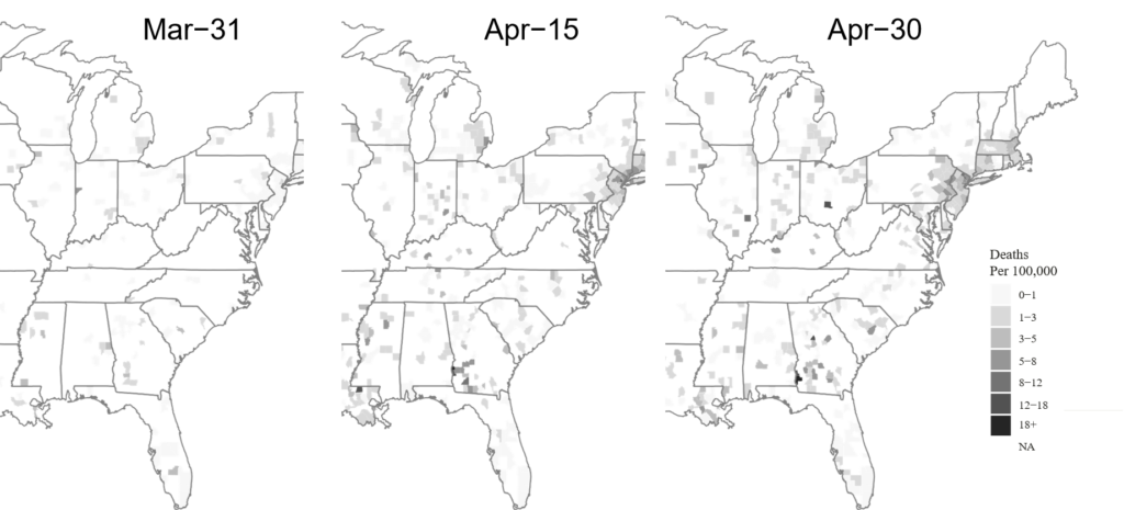
This diagram shows population-adjusted death rates over the eastern half of the US. There are two major patterns that stand out. The first is the broad, moderate death rate in the Northeastern corridor. Intense infection rates and high population density seem to explain most of that.
The other pattern is the rapid appearance (and rapid disappearance) of clusters of fatalities in rural areas. It seems that, when COVID comes to rural America it comes to the long-term residences, churches and poultry plants. Sort of a deadly Whack-A-Mole. The threat this poses is to create intense, but short-lived, clusters of infection that can be easily carried to nearby areas and cities. Those cities and towns have the populations to fuel longer term outbreaks.
Final Observations
My goal in doing this analysis was two-fold. First, I needed something to fill time in lockdown. Second, I quickly began to see interesting patterns in the COVID-19 spread that I thought other eyes should view. There are patterns to COVID-19 that aren’t reported on the news and only written about in the more arcane publications.
I have shared some of my thoughts and observations, but they’re just speculations and open to critiques and alternative explanations. I am hoping that readers will use my social media pages (facebook, twitter and linkedin) to share their ideas and insights. YMMV.
[If you would like to review the R programming code that generated these maps, please contact me via my LinkedIn or Facebook social media account. I would post it publicly, but I haven’t done much commenting yet and I am frankly embarrassed. I will be more inclined to share if I think we can collaborate on other R stuff to try to understand this monster better.]