
In a previous post, I described a novel way to use video to capture visual evidence of process variation and make it far more evident to potential stakeholders. The technique used the Dartfish Analyzer video blending feature from the Dartfish video analysis software. The resulting video looks like the following:
You can clearly see evidence of process variation, but it is still not something you can quantify and analyze. To convert the video into data requires some more features from Dartfish … plus some free statistical analysis software (in this example, R).
The first step in analyzing the video is to create a measurement scale. There are many ways to do this, but the following method is simple and reasonably accurate. The trick is to construct a suitable scale or measurement tool in PowerPoint.
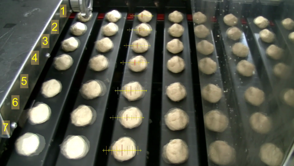
Select all of the elements of the scale, right click and “Save as Picture”. You will get a .png file with the scale and a transparent background. This file can be imported into Dartfish Analyzer and installed as an overlay on the video. I imported it and copied it to create 7 scales … one for each row of dough balls. I used the metal conveyor plates as references to “scale the scales” to correct for perspective. The following is a snippet from the result.
So how do you use the scale? Good question.
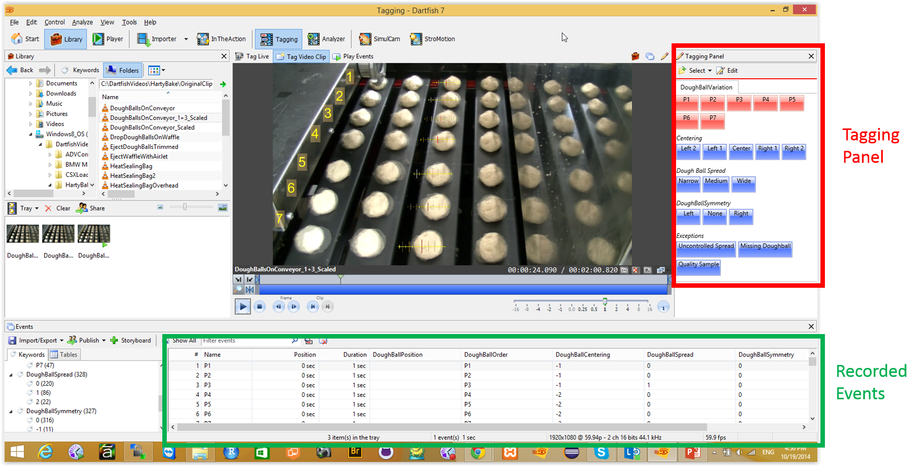
The next trick is to take the scaled video into the Dartfish Tagging tool (just a different menu tab). In the tagging tool, I designed a “tagging panel”
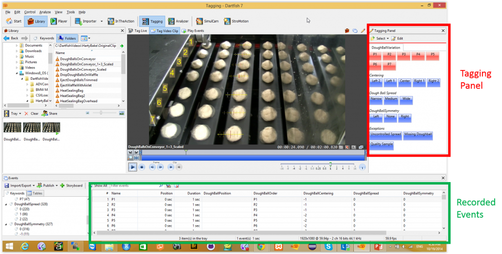
As the video rolls by (or more likely as I inch it forward a few frames at a time), I can use the tagging panel to record observations that fill a table. I inch the video to the point that a registration mark exactly lines up with the right side of a metal tray. I can then estimate the amount of offset and the magnitude of the spread. That is a crude version of mean and standard deviation. It isn’t laser accurate, but it is pretty good when there are several hundred trays.
Dartfish will export the tagged results as a CSV file … like the one shown below.
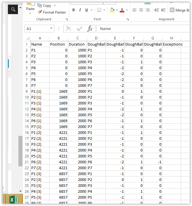
At this point, I can analyze the data in any analytical tool that I choose. For example, many people will probably choose Excel. As it happens, I am a fan of the free R statistical analysis software ecosystem. If you can’t find a way to do an analysis in R, the analysis method probably doesn’t yet exist. So my next step was to pull the data into R and write some short analysis programs to crunch it and plot it the way I wanted.
The analysis program is shown below … in the very cool RStudio (and free) development environment. The actual working program (excluding comments and white space) is only 12 lines of code. It inhales the CSV file and spits out a “heat map” showing the distribution of offset and spread for the trays in the video clip.
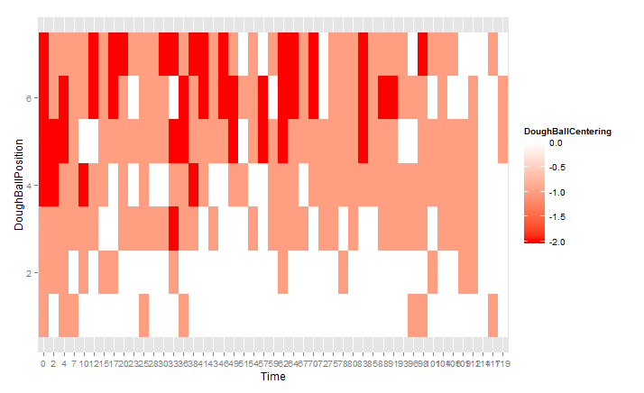
The graph shows the relative offset for the dough balls on the trays as they passed by in the time period of the video. Just to clarify, the vertical positions in the video and the position numbering in the graph are reversed, so the dough balls that were closest to the camera in the video are at the top of the graph, not the bottom. The result clearly shows the consistent pattern by which the dough balls were offset on one side of the machine.
Bottom Line
You could likely have achieved a more precise analysis if you designed, installed and configured a machine vision system. However, this is pretty decent for a standard 30 min HD video recording and a few hours of work. The data supports and confirms the visual impression that was drawn from just watching the video (see my previous post) … and the setup costs a lot less than an purpose-built vision system.
Can you help?
I’m not an employee, partner, investor or reseller for Dartfish, but they are kindly letting me play with it to explore any non-sports uses I can cook up. I am willing to play with videos sent to me by others as long as they don’t hold me to a deliverable timeline and they give me permission to post useful pieces on the blog.