
A lot of process variation occurs over extended periods of time. You can see that something may be happening, but the quantity and nature of the variation is not obvious. The following clip (from our friends at Hartybake) shows a conveyor system that is carrying balls of dough toward a continuous oven.
You can see subtle variations in the placement of the dough balls. One of them is highlighted. Most of the variations are probably not significant, but they might signal an issue with the machinery that deposits the balls on the plates. Perhaps the variations aren’t important now … but if they increase, eventually product might be lost.
Traditional Approaches
The conventional approach to studying this is to apply some form of SPC (statistical process control) measurement. You could stop the line (not a good idea) or take periodic photographs (a better idea) to sample the positioning. If you track the results over time on a control chart, you should spot if systematic shifts are happening. This method is not to expensive, but it will only give you a general warning. It probably won’t help much to pin down the root cause.
If enough is at stake, you could install a vision system to precisely measure dough location and accumulate a detailed and precise data record. That would permit very sensitive analysis … but it is expensive and time-consuming to design and set up. For an application like this, it probably isn’t worth it.
The Dartfish Approach
Dartfish is video analysis software (and a supporting web video ecosystem) that dominates the analysis of videos in athletics. It has a wide range of cool functions that seem like they might be useful to analyzing other dynamic behaviors. So can they be applied to this problem?
One idea is to apply the Blend feature in Dartfish’s Analyzer Panel. This tool can overlay two video clips (or two different segments of the same video clip) on top of one another … making both clips partially transparent. It also allows you to slide the two clips relative to one another to synchronize the background. The following snippet blends two segments of the dough conveyor video.
Now variations in dough shape and placement can be seen quite easily. The transparent areas show the differences between two different balls. Note that the background conveyor plates are in sharp focus. That indicates that they are moving in a fixed, controlled manner. If their edges were fuzzy, we would suspect that there is some slop or slack in the conveyor drive mechanism.
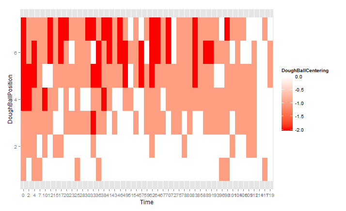
We can take the blending method and push it a bit farther. The following diagram shows how we can record one long clip, then shift it, subdivide it, blend it and stack the blends to compare more examples for variation.
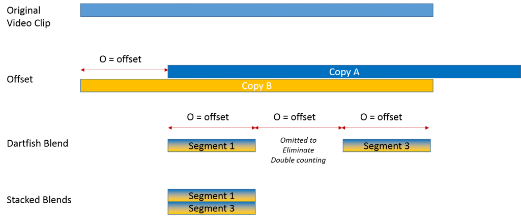
We take the video clip, make a copy and offset one relative to the other (e.g., by 2 min.). Then we blend the two videos. Next, we take subsections that are as long as the offset and blend them. If we take every second segment, we can ensure that no video footage is used twice. We then blend two of the already blended segments. That gives us four different clips laid on top of one another. If we want, we can stack 6 or even 8 clips. You can see the effect for four blended clips in the following video clip.
If you watch the clip all the through (it is only 15 sec.), you will see startling examples of variation. This is behavior that would mostly be invisible to the casual observer and is even probably too subtle to someone just watching the original video.
Beyond the fact that there is a lot of variation, it also seems (actually borne out by analysis of the longer original video) that the variation is higher in the rows of dough balls closest to the camera. This suggests that there may be some problem with the equipment that deposits the balls … and the problem is worse on one side.
How Hard is This?
Using Dartfish Analyzer for this exercise was very easy. The original video was easy to shoot. Just point the camera correctly and let it run. There are so many good cameras (including on smartphones) that will capture HD video as long as they are held still. So 30 min of source video took about 30 min to record.
Slicing and dicing the video sections for stacking was also easy in Dartfish. The Analyzer tool is designed for the purpose. Load a video, copy it, slide it by the offset, then grab and export subsections. Maybe a couple of hours if you are a novice … 30 min if you know what you are doing. Stacking multiple blended segments is just as easy.
Bottom Line
This approach generates a powerful visualization of process variation. There is nothing abstract or conceptual about it (unlike control charts). The existence (and to some degree the magnitude) of the process variation is a picture that leaps out of the video. If you want stakeholder buy-in, this is a powerful way to go.
Of course, so far this methodology is more visualization than analysis. I will write another post shortly that shows how to extract quantitative data from the video and use it in more formal analysis.
Can you help?
I’m not an employee, partner, investor or reseller for Dartfish, but they are kindly letting me play with it to explore any non-sports uses I can cook up. I am willing to play with videos sent to me by others as long as they don’t hold me to a deliverable timeline and they give me permission to post useful pieces on the blog.