
I haven’t written a post for nearly two weeks because I was engaged in a small project to stretch and enhance my skills. It’s been a year or two since I built a decent statistical analysis in R and Shiny. My most recent work product is now online. You can click the following image or the link below it to visit the site.
The data comes from the nice people at the New York Times. They have a team that scours state websites to get the latest COVID-19 case data. They maintain a GitHub page where they upload their findings every evening. In general, today’s data will become available sometime tomorrow evening.
My Shiny and R graphic website loads the NYT data each time your browser visits the page. So it is always the latest and greatest NYT collection. That means I don’t have to remember to maintain the site. If you visit it tomorrow or in days after, you should automatically see the most recent calculations.
Finally, my R and Shiny skills are a bit rusty and there are quite a few places where the site isn’t as well labeled or formatted as I would like. There is even an annoying little bug report that pops up as red text when you first load the page. It appears to happen because some part of the code loads before it has everything it needs, but eventually gets it and the error resolves itself. I could have waited until I tracked it down, but it seemed better to make it available as is and putter away on improving (and perhaps expanding) it as I find time.
With those caveats, please enjoy! The following sections will look at some of the tabs and visualizations that are currently available … along with my thoughts about what they might or might not mean.
Growth in Total Cases
The first graph shows the pattern by which total cases have increased in those US counties that reached 1000 cases by the time you view it. The salmon colored section indicates the time range when statewide shelter-in-place mandates were in effect.
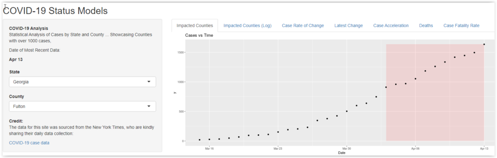
In most cases, the pattern is a gentle curve or s-curve. The initial growth in cases shows accelerating growth, generally approximating an exponential pattern. As the effect of shelter-in-place kicks in, the growth appears to moderate. However, it is hard to generalize comparisons across growth curves, especially when the case counts are so different. New York City has 100 times as many cases as some of the more rural counties.
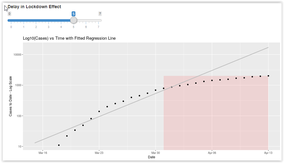
Case Growth on a Log Scale
This is arguably the most useful graph in the set. It takes the total number of cases and plots on a logarithm scale. This doesn’t change any numbers, but it systematically compresses the higher numbers so the patterns are more comparable.
Using a log scale also makes it easy to fit a simple linear regression line through the early case history. This should capture the nature of the initial “natural” exponential growth prior to any policy intervention. There is a slider that controls how many days into the shelter-in-place policy are included in fitting the regression line. The reason for that is that it takes about 5 days for symptoms to appear after infection and, assuming infections were suppressed by the lockdown, it would take 5 days or so before the curve could be expected to change.
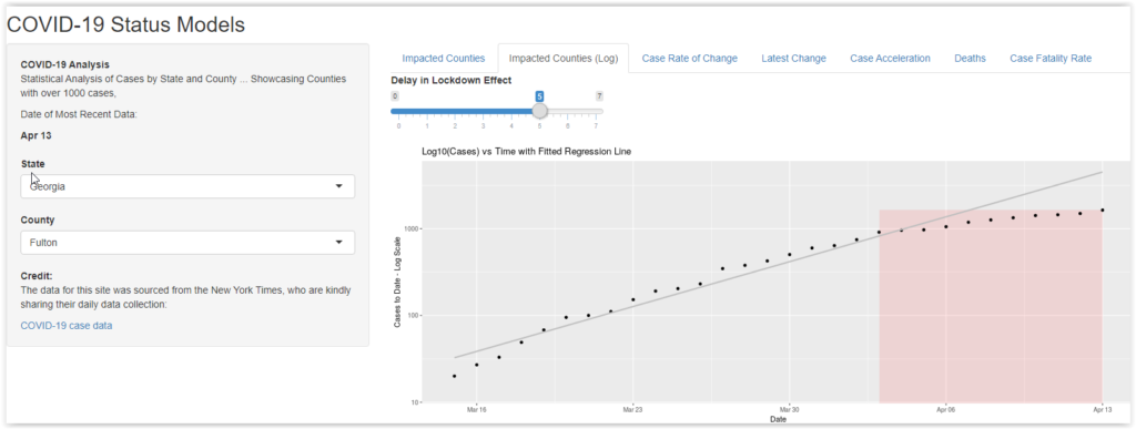
If you explore the curves for counties around the country, it is heartenting that virtually all of them show the growth in total number of cases slowing down after lockdowns were initiated. In many cases (especially where statewide lockdowns were delayed), the bending of the curve started before the lockdowns were mandated. I am hopeful this means that Americans were taking the social distancing to heart … even without having to be forced to do it.
Rate of Change in Total Cases
This graph is pretty simple. It shows the number of new cases per day, with a smoothed LOESS curve fitted to help visualize it. I don’t see any systematic message here, except that there is so much variation between the different counties. Whatever is driving changes in total cases, it is not affecting the country as a whole. There is a lot of local variation in play.
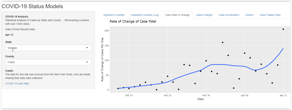
For some counties, there are reassuring patterns where the rate of new cases is starting to rapidly diminish. Unfortunately, there are others where the new cases are increasing. Regardless, we are a long way from the point where COVID-19 case growth is over.
Most Recent Case Growth
I included this table to answer one question. How many places have reached the point where there are no new cases? The answer, as of April 14, is essentially none. Out of the 87 counties with more than 1000 cases, only two show no new cases. Many counties showed more than a 5% increase … in the past day.
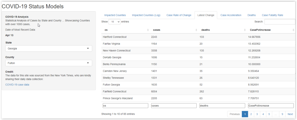
To me, on April 15, the idea that America should relax the lockdown is certifiable lunacy. We have rapidly growing confirmed case clusters all around the country. When this list shows all (or at least mostly) very small changes (less than 1% in most counties), we might be able to begin to think about that. If we were to loosen up now, it seems inevitable that we would quickly restart exponential growth and quickly return to the horrors we have been trying so hard to escape.
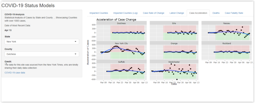
Hitting the Gas and Pumping the Brakes
One of the most interesting analysis is also one of the hardest to characterize or understand. In this panel, I used an R function to estimate the second derivative of the total case time series for each county. This is normally a pretty sketchy exercise because it is a time series and there are not that many data points.
The idea is to fit a smooth curve (in this case a spline function) to the reported case data and estimate both the first derivative (rate of change) and second derivative (positive or negative acceleration of the change) from the smoothed curve. In the graph below, the pink area shows that case growth is accelerating (think mashing the accelerator). The green area shows that case growth is decelerating (think foot on brake). The problem is that the underlying calculations tend to amplify the “noise” in the data. It’s hard to trust any specific meaning from the resulting picture.
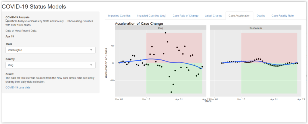
However, the contrast is pretty odd. The panel on the left is for King County, Washington (aka Seattle). The data is chaotic, like a nervous driver who is constantly alternating between accelerator and brake. The one on the right is for Snohomish County, right next door. It’s as smooth as you might expect from an airport limousine driver. If you explore the data for other counties around the country, you’ll see many examples of similar contrasts. Some counties are chaotic while others nearby are smooth as silk.
I don’t honestly have a clue about the reason behind either pattern, but I can speculate on at least one possibility for each. Take these with a truckload of salt:
- The infection process is more chaotic in some places – The first cases in King County were linked to an old-age home where a lot of people got sick and, unfortunately, many died. Perhaps in urban areas, there are more opportunities for these types of “cluster” infections and that results in a fitful growth pattern.
- The smooth growth signals testing limitations – Imagine that Snohomish has cases, but Seattle nearby is blowing up. When test kits were scarce, might the State tell Snohomish to make do with x number of test kits per day? With plenty of suspected cases, those kits would have a high hit rate. In other words, Snohomish would steadily report as many cases as it had gotten test kits. Nice, smooth growth … and totally inaccurate.
Again, I don’t know what mechanism applies, but the difference in acceleration patterns suggests that something is at work. This is an example where an exploratory data analysis can’t be used to prove or predict anything, but it can reveal distinctions that might, on further study, prove useful. Suppose, for example that an unnaturally smooth curve typically results from a resource constraint. One could analyze data across a state or the country and use the data to raise a red flag for areas that are not getting enough diagnostic supplies. It would be a fast, cheap diagnostic.
If that assumption were true.
Deaths and Changes in Death Rates
Ultimately, the metric that is most important is the death rate. Most people don’t want to get sick, but they really don’t want to die. If COVID-19 had a much lower death rate, our society and economy would be operating much more freely.
The last two panels show the growth in deaths by county and state, as well as the relative mortality rate taking the total number of cases into account. In both cases, the thing that stands out is the differences between different jurisdictions in the country.
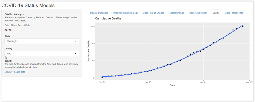
Remember that all of the counties displayed on the site have at least 1000 cases. They are all well along in the process that spreads the infection. They have all had significant cases for a number of weeks.
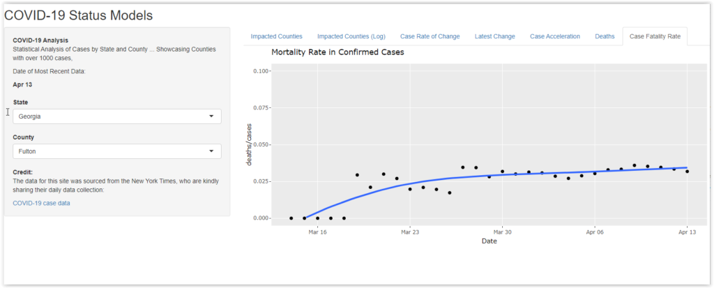
One might expect to see big variations early in the growth cycle. For example, if COVID-19 gets its first county foothold at a Church service with an elderly congregation, it might jump off with a higher mortality. However, the counties on the Shiny website have had a growing caseload for some time. It is odd that the mortality rates can be under 1% in one county and over 5% in another. That suggests that there may be other factors that impact mortality. That, in turn, may be a cause for hope. If we can isolate those factors (e.g., treatment protocols), we might be able to reduce the death rate.
Summary
It should be obvious that I enjoy studying data. I have a strong realization that my insights are tentative or possibly quite wrong. Nonetheless, I feel like there is always some thing to learn or something to provoke curiosity and thought when you dive into real numbers.
If anyone wants to comment or discuss the background methodology or R code, please reach out to me at the Facebook or Linkedin sites that are linked from their icons at the top of this post.
If someone wants to take this effort and elaborate on it, let me know. Maybe we can collaborate and have some fun.